@soldni
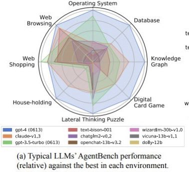
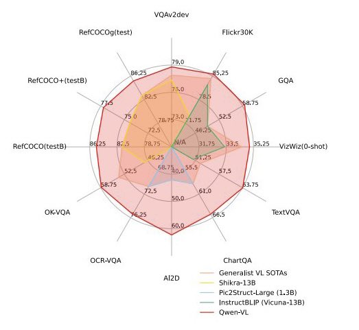
Please no more radial plots! • linear improvement, but area grows quadratically ➡️ overestimate perf • hard to label axis ➡️ no quantitative use • overlapping colors ➡️ poor accessibility consider a bar chart or a table instead 🙏 https://t.co/NrztmjDRVn